 THE UNIVERSITY OF CHICAGO


Air quality study shows the impact of data accessibility
University of Chicago researchers, including Isaac Kamber, BA’21, create a user-friendly dashboard for public health officials
By Sarah Steimer
Students and faculty at the University of Chicago are working on ways to track air quality and public health across the city. While the fruits of the work will improve the health of Chicagoans and beyond, the project is also helping to instill the importance of data that’s digestible — so that decision-makers can enact change.
“There’s a need to not just have data,” says recent graduate Isaac Kamber. “But data that’s accessible and easy to understand is super important. There’s a need for research to be understandable, accessible, and useful.”
Kamber, who majored in geographical sciences and Near Eastern languages and civilizations, has worked on the air quality project since his first year at the university. He was recruited as a research assistant by Marynia Kolak, associate director for health informatics in the Center for Spatial Data Science. This project is one of many focusing on how place impacts health at the Healthy Regions and Policies Lab at the University of Chicago.
The team initially used the Array of Things (AoT) to track air quality across the city, as AoT was a network of sensors that attempted to track data in real time across Chicago. Kamber said the team did a lot of data-wrangling and aggregation in the initial phases of the study. They eventually moved away from AoT to use publicly available, open-source data from EPA sensors, NASA satellite data, and elsewhere to model air quality at the neighborhood level.
“We've worked closely with the Chicago Department of Public Health (CDPH) and have been trying to keep in tune with what their needs are and adjusting the project as needed based on what they want to do,” Kamber says.
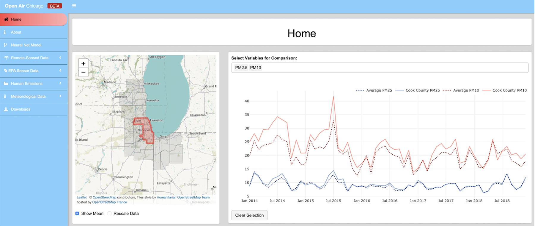
More than two years ago, Kamber’s focus shifted to creating a dashboard for the CDPH to better comprehend the data that the team collects. The dashboard incorporates about a dozen and a half variables that are known to impact air quality for 21 counties around Chicago. City officials can review the variables over time and space to see how they change and to consider what local relationships might be at play.
Kamber spent summer 2019 developing the dashboard based on meetings with the department as part of the participatory design strategy. He gives one example of a model in the dashboard that shows fine particulate matter (PM 2.5) — an air pollutant that, when high, can negatively affect people's health — in the 21-county area around Chicago. The model showed spikes in PM 2.5 around suburban quarries, which tracked with other knowledge known from the wider team.
“Being able to show that and have them say, ‘That makes sense, given what we know that X, Y and Z,’ was awesome to see — and validating,” Kamber says.
Kamber says the team has been using Center for Spatial Data Science resources to better handle some of the data processing related to the project. He says the satellite data can be particularly computationally intensive: “Trying to run that on a little 12-inch Mac laptop takes about a week or two,” he says.
The study was detailed in a poster presented at the American Meteorological Society conference this year. The poster, titled “Open AirQ: An Open Spatial Data Infrastructure for Integrating and Visualizing Air Quality Data for Public Health,” illustrated how the team streamlined a large amount of raw data into a compact, usable dashboard. It also highlighted how the exclusive use of publicly available data and open-source methods could maximize transparency and increase the likelihood of the dashboard being reproduced. The team’s poster won first place in the “Societal Impact” Category at the conference.
Last year, Kamber and Kolak also presented on the technical infrastructure of the dashboard at an interdisciplinary R coding group based out of John Hopkins, by invitation.
The team has created some side project tools related to the main study as well. For example, they created a tree dashboard for identifying areas where planting trees would be most beneficial for public health in Chicago. Their efforts also include toolkits to make their research more accessible for others interested in exploring air quality, but don't necessarily have the technical expertise to jump in.
This data accessibility has been a key takeaway for Kamber, who also underscored the role of communication between the research team and CDPH to ensure the end product would be user-friendly.
“Going into the workforce, a skill that seems to be pretty valuable is the ability to convey quantitative concepts or concepts from the data in a way that makes sense outside of the context of data itself,” he says. “This job very much changed my trajectory. Going into it, I had no clue what geography really was — beyond what I'd learned in the social sciences sequence — and I came out as majoring in geography.”
This project involved many students and interns, including Lorenz Menendez, Yuming Liu, Jizhou Wang, Yao Xen Tan, and Arpan Laha. Andrew Morse currently serves as a Harris Applied Data Fellow for the project. Two international visitors, Anaïs Ladoy (École Polytechnique Fédérale de Lausanne) and Jionghua Wang (Chinese University of Hong Kong) also contributed to the project.
More details about the air quality dashboards will be released in late 2021. The project is in collaboration with the Partnership for Healthy Cities, a global network of cities committed to saving lives by preventing noncommunicable diseases and injuries, supported by Bloomberg Philanthropies in partnership with the World Health Organization and Vital Strategies.